Warum sind die Dinger rund?
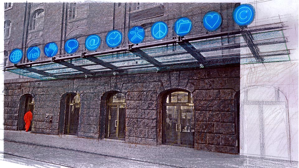
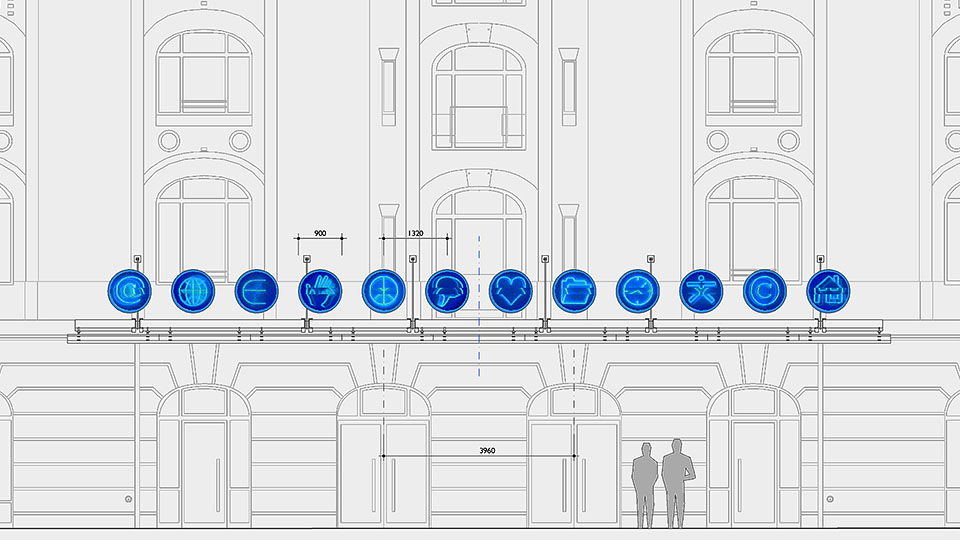
Das Thema der12-teiligen Neonskulptur für das Vordach des Getreidespeichers sind die neudeutsch „Buttons“ genannten Bedienknöpfe, die sich früher hauptsächlich auf Stereoanlagen und Waschmaschinen gefunden haben. Heute aber werden diese ehemals physikalischen Schalter virtuell nachgebildet, um Funktionen in Software-Programmen wie Word oder Photoshop aufzurufen und – noch viel wichtiger – um die Navigation durch das endlose Internet zu erleichtern bzw. erst zu ermöglichen.
In klassischer Manier sind die Bedienknöpfe rund, wegen der einfach auszuführenden Bohrung in den Frontpanelen der Geräte. Diese Form wurde für die einst revolutionäre grafische Benutzeroberfläche von Appel übernommen und wird auch heute in der Gestaltung von Internetseiten nach wie vor gerne genutzt.
Die klar zu indentifizierenden „Knöpfe“ des „Menüs“ über dem Haupteingang des Getreidespeichers nehmen Themen auf, die für die Firmen der New-Economy, die in das Gebäude einziehen werden, von zentraler Bedeutung sind. Dazu zählen vorrangig das Internet, der Euro, die Maus, die Welt, die Uhr, das Copyright, der Ordner etc. . . . Damit das ganze aber nicht in Banalität abgleitet und weil das Leben sich nicht nur in planbarer Technik und gewinnmaximierter Zeit erschöpft, sollen ca. 1/3 der Zeichen Werte vermitteln, die emotionaler, idealistischer, kritischer oder dadaistischer Natur entspringen. Dabei denke ich z.B. an das Herz, das Peace-Zeichen, die leere Sprechblase . . . So wird der Weg zur Arbeit bzw. ein Besuch im Gebäude zu einem anregenden Erlebnis, bei dem man je nach Tagesverfassung von anderen Motiven inspiriert werden kann.
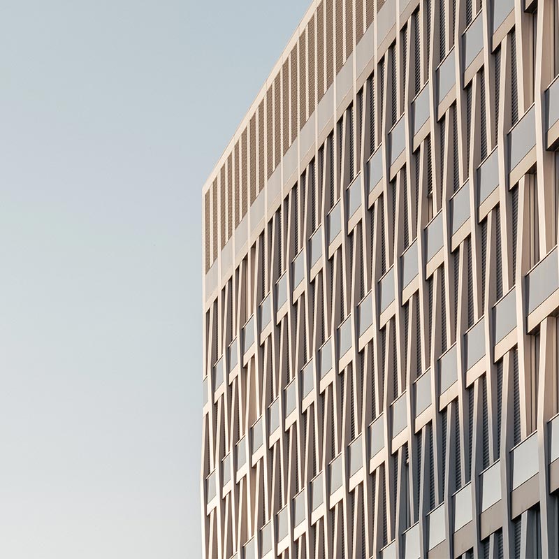
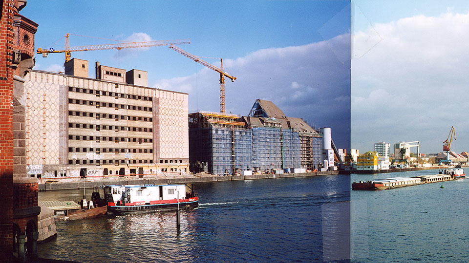
Die freie runde Form, das semi-transparente Material, das immaterielle Neonlicht, die flexible Steuerung, die fast unsichtbare Befestigung ist auch deswegen gewählt worden, um einen möglichst schwebenden, leichten Charakter des Kunstwerkes zu erzeugen. Dieser steht in bewusstem Gegensatz zu der schweren traditionellen Klinkerstruktur des denkmalgeschützten Getreidespeichers mit seinen aus massivem Stein gehauenen Allegorien auf die von harter körperlichen Arbeit geprägten Erwerbswelt des 19.ten Jahrhunderts.
//
Why are these things round?
The subject of the 12-part neon sculpture for the canopy of the granary are the control knobs known in new German as „buttons“, which used to be found mainly on stereo systems and washing machines. Today, however, these formerly physical switches are recreated virtually to call up functions in software programmes such as Word or Photoshop and – much more importantly – to make navigation through the endless internet easier or even possible in the first place.
In classic fashion, the control buttons are round, because of the easy to drill hole in the front panels of the devices. This shape was adopted for Appel’s once revolutionary graphical user interface and is still popular today in the design of Internet pages.
The clearly identifiable „buttons“ of the „menu“ above the main entrance to the granary take up themes that are central to the new-economy companies that will move into the building. These primarily include the internet, the euro, the mouse, the world, the clock, copyright, the folder, etc. . . . But so that the whole thing does not slide into banality and because life is not only exhausted by plannable technology and profit-maximised time, about 1/3 of the signs are to convey values of an emotional, idealistic, critical or dadaistic nature. I am thinking, for example, of the heart, the peace sign, the empty speech bubble … . In this way, the way to work or a visit to the building becomes a stimulating experience in which one can be inspired by other motifs depending on the state of the day.
The free round form, the semi-transparent material, the immaterial neon light, the flexible control, the almost invisible fastening was also chosen to create a floating, light character of the artwork. This is in deliberate contrast to the heavy traditional clinker structure of the listed granary with its allegories carved out of solid stone of the working world of the 19th century characterised by hard physical labour.